Taco Rocco


The Product
Taco Rocco is a new popular taco truck serving Washington DC Metropolitan Area. Taco Rocco strives to be the best, healthiest, and cleanest taco establishment in the DMV area. They offer a wide verity of tacos to all types of customers, from vegan to die hard taco lovers.
Project Duration
August 2021 to October 2021
The Problem
Professionals with limited time lack the time to wait in line.
The Goal
Design an app for Taco Rocco that allows users to bypass the long lines and easily order and pick up their tacos.
My Role
UX designer designing an app for Taco Rocco from conception to delivery.
Responsibilities
Conducting interviews, paper and digital wireframing, low and high-fidelity prototyping, conducting usability studies, accounting for accessibility, and iterating on designs.
User Research
Summary
I conducted interviews and created empathy maps to understand the users I’m designing for and their needs. A primary user group identified through research was working adults who don’t have time to wait in long lines.
This user group confirmed initial assumptions about Taco Rocco’s customers, but research also revealed that time was not the only factor limiting users from waiting in line. Other user problems included obligations, interests, or challenges that make it difficult to wait in a line for more than 10 minutes just to order tacos.
Pain Points

Time
Working adults are too
busy to spend time in line

Accessibility
Platforms for ordering food
are not equipped with
assistive technologies

IA
Text-heavy menus in apps
are often difficult to
read and order from
Problem Statement:
Vikki lives a very busy lifestyle with 3 young kids. Jennah 3, Kelly 5, and Danny 6. Her husband Jeremy is a lawyer, who is also very busy and doesn’t have time to cook either.

,VA

Design Process
Wireframes


Low-Fi Prototype

Usability Study
Parameters

Study Type
Unmoderated

Participants
3 participants

Location
Washington D.C., remote

Length
10-20 min
Findings
I conducted two rounds of usability studies. Findings from the first study helped guide the designs from wireframes to mockups. The second study used a high-fidelity prototype and revealed what aspects of the mockups needed refining.
Round 1 findings

Users want to order tacos quickly

Users wanted more pictures

Users wanted pickup time option
Round 2 findings

The navigation bar isn’t that useful

Some text was hard to read
Final Iteration
Hi-Fi Prototype

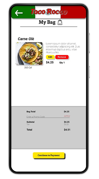
Final Design


